Wedding Colour Schemes: 15 Beautiful Palettes for Every Season
We reveal the beautiful colour combinations you need to consider. These wedding colour schemes will work for spring, summer, autumn and winter, from a fresh take on pretty pastels to the boldest brights. Get ready to find your perfect palette!
We have included third party products to help you navigate and enjoy life’s biggest moments. Purchases made through links on this page may earn us a commission.
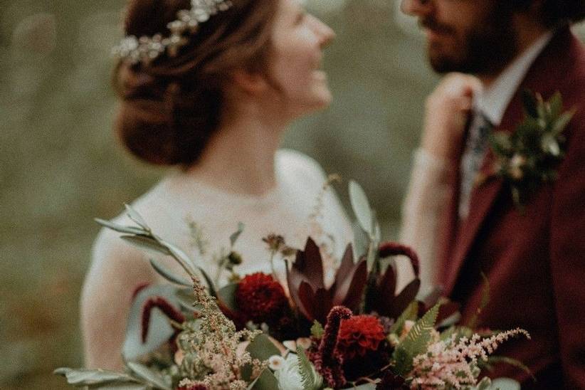

Do you need a colour scheme for your wedding? Strictly speaking, no - the style police aren't going to turn up on the day and demand to see your moodboard. But the thing about wedding colour schemes is that they make it so much easier to put together a beautiful look for your celebration.
Once you've chosen your wedding colours, you'll be a whole lot clearer about which wedding décor ideas will work for you. You don't have to stick to your palette religiously - we're not talking matchy-matchy. Just work within your chosen colour families and you'll be able to create a cohesive, pulled-together look.
Your wedding colours will also help you clarify the feel you're aiming for. Soft and romantic? Blush pinks will put that across. A joyous, party-centric feel? Jewel tones or citrussy brights will lift the mood.
To get you inspired, we've picked out our favourite wedding colour schemes for 2020 and beyond.
READ MORE
- 63 Outdoor Wedding Ideas You'll Fall in Love With
- How to Update Your Wedding for a Different Season
- Spring Colour Palette Ideas for 2021
1. Ocean Blue, White & Green
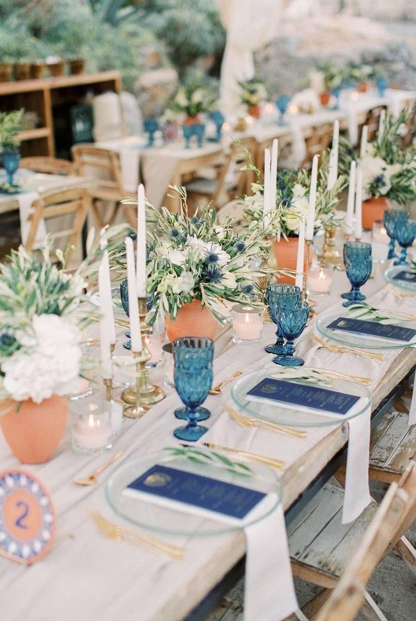
Image: Pinterest
Blue and white together creates such a fresh, Mediterranean-inflected feel, particularly with vibrant green foliage in the mix. You can add extra warmth with earth tones, such as the terracotta pots seen here. When choosing your shades of blue, think in terms of different shades of the oceans, from dusky blue to turquoise.
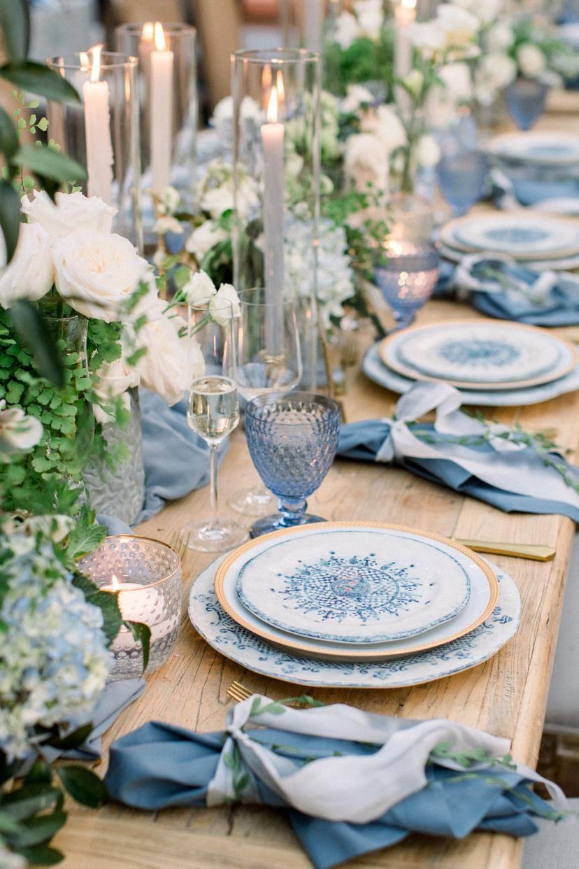
Image: Pinterest
You can include some paler blue touches, but make sure you have the darker shades in there, too - if you go for all pastel against white, you lose the holiday-fresh vibe.
2. Mixed Pastels
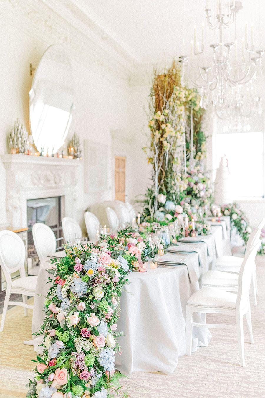
Image: Sanshine Photography
Pastels have long been associated with weddings. To give the look a contemporary edge - while still keeping the romance - combine a diverse range of colours in pale shades. Pinks, yellows, blues, purples, greens: putting them all together like this feels more current than combining just one or two colours.
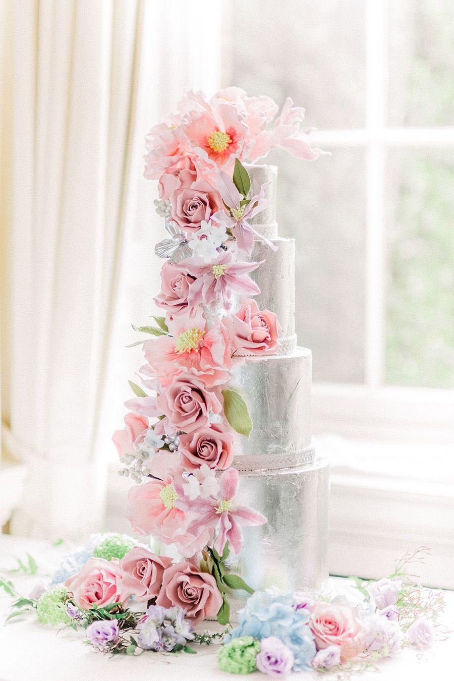
Image: Sanshine Photography
Metallic touches bring an added crispness. Don't limit yourself to the tableware - the cake can go metallic, too, feeding into the overall look.
3. Peach & Turquoise
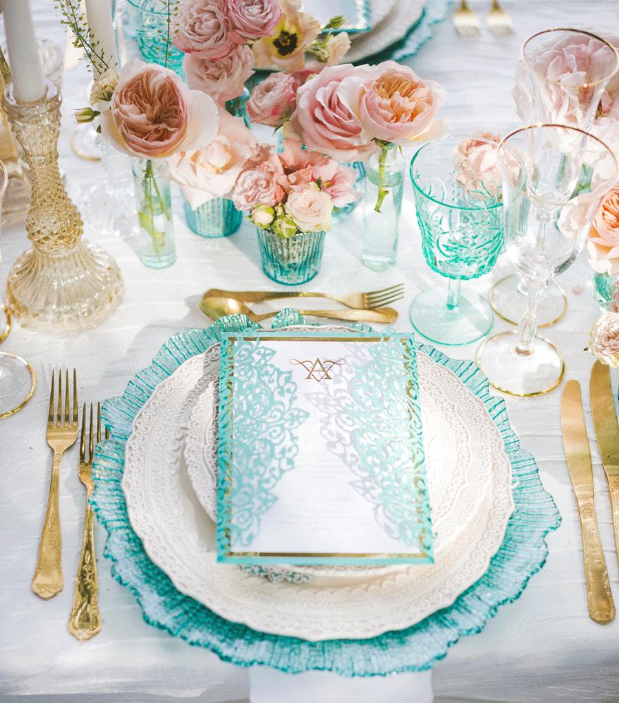
Image: Anna Marie Photography
There's something so joyously elegant about this colour combination. If you want to dial up the contrast, you could swap out the peach for a coral, but we think the gentler hue works particularly well against the turquoise. Add gold accents for glamour.
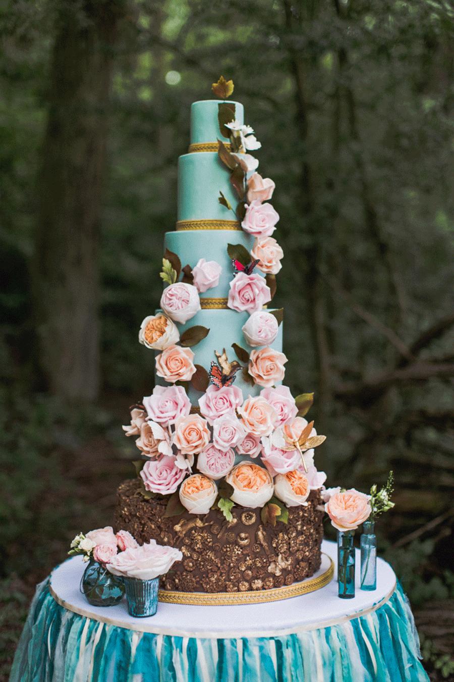
Image: Anna Marie Photography
When you're working with a palette of strongly contrasting colours, you don't necessarily need large floral displays - single-stems in vases will make a real impact.
4. White & Green
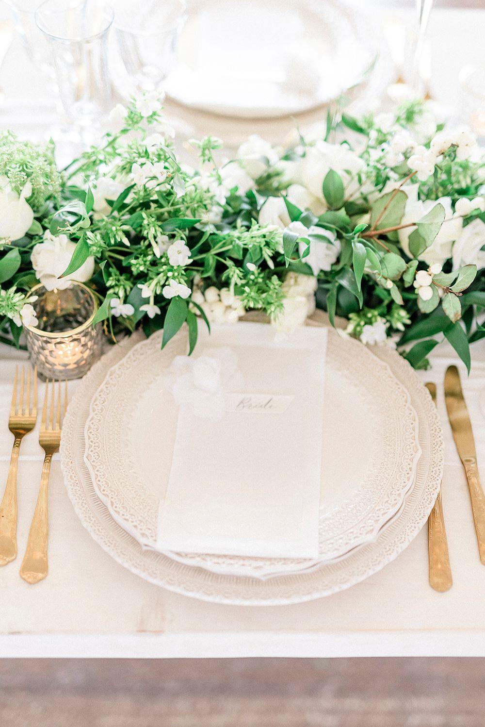
Styling: Penelope at Tigerlily Weddings | Image: Gianluca Adovasio
This classic colour palette is all about easy elegance. For a cohesive look, we recommend sticking with the same shades throughout: dazzling white against bright foliage green is our preference, but you can always soften the effect with an ivory and sage.
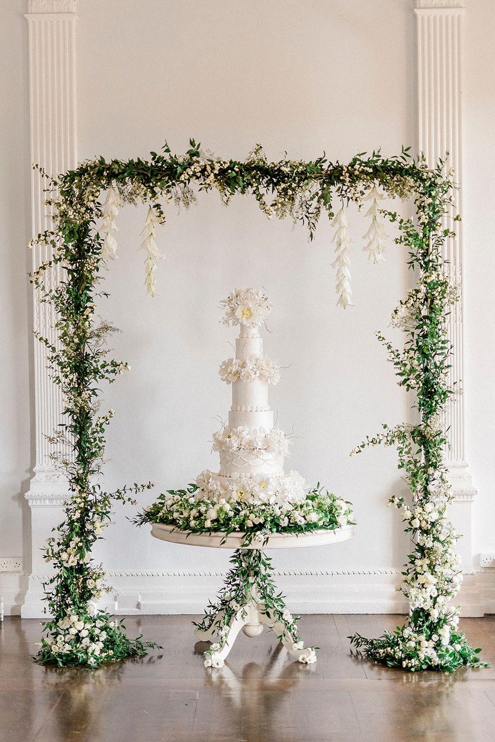
Styling: Penelope at Tigerlily Weddings | Image: Gianluca Adovasio
White wedding cakes are traditional, but you can give yours a contemporary spin through sugarwork details, from flowers to ruffles.
5. Burgundy, Dusky Pink & Cream
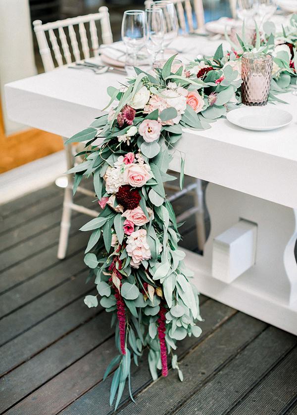
Image: Pinterest
Burgundy adds a seductive tone to the prettily romantic combination of dusky pink and cream. This is a colour palette that works in any season, giving a look that's both rich and delicate.
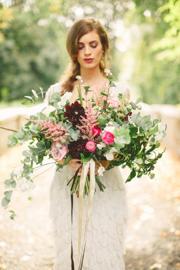
Image: Pinterest
If you think the look needs more drama, add in some hot pink - those colour pops will really make floral arrangements sing.
READ MORE: Vintage Wedding Decor: 36 Beautiful Ideas for Your Reception
6. Pale Green, Blush & Blue-Grey
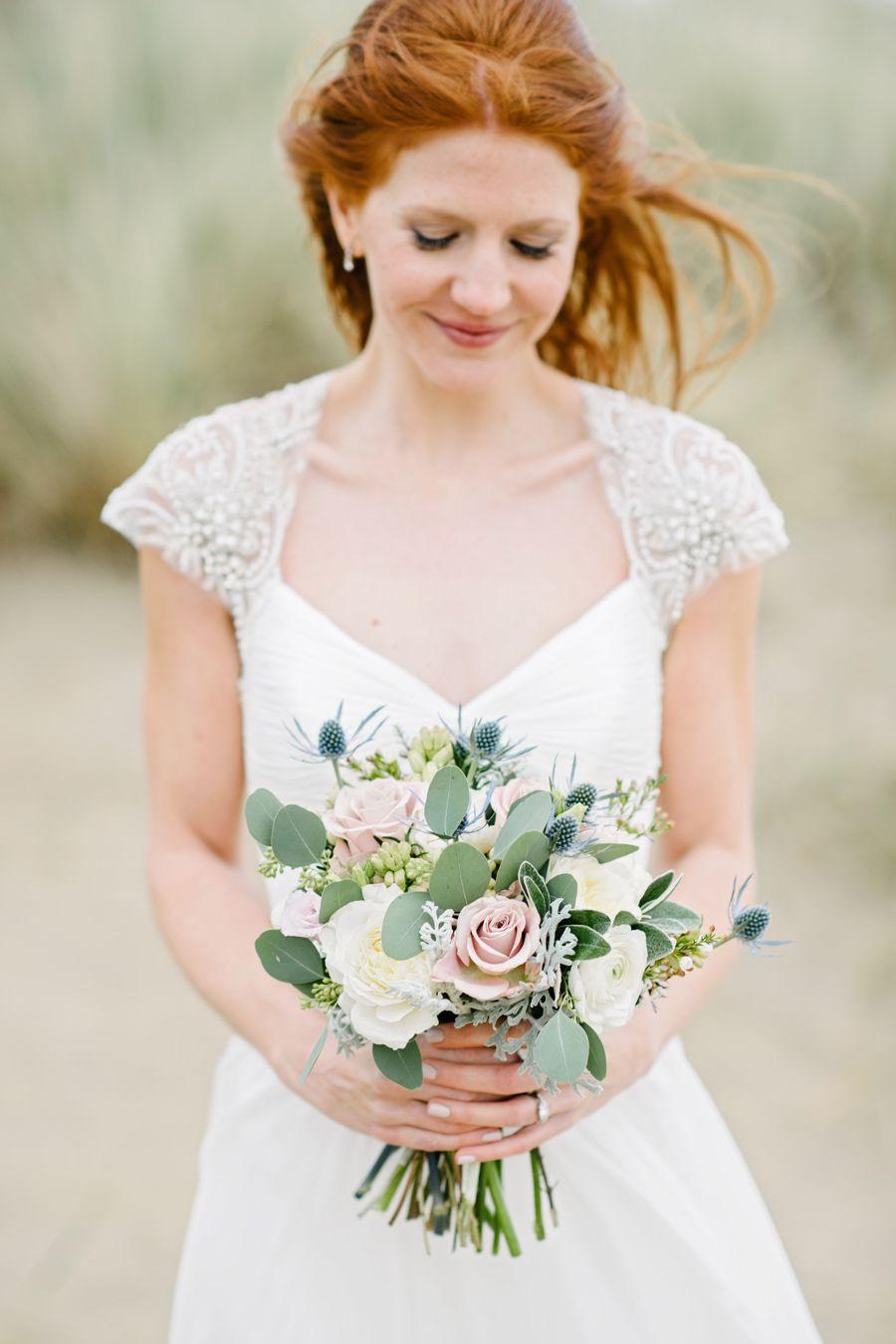
Image: Dominique Bader
We're being super-specific with the shades here for a reason. This is a delicate, elegant combination, but it does rely on colour-precision to keep it feeling fresh. A dove grey, for example, would bring the look down, while a brighter green would overwhelm the other colours.
Image: Dominique Bader
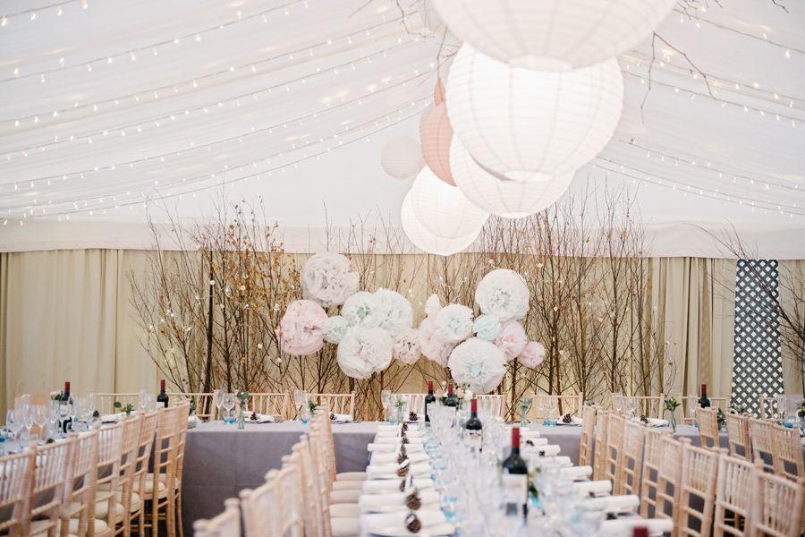
You can add pops of colour, as here with the teal wine glasses, to liven up your reception tables.
7. Yellow, Purple & Pink
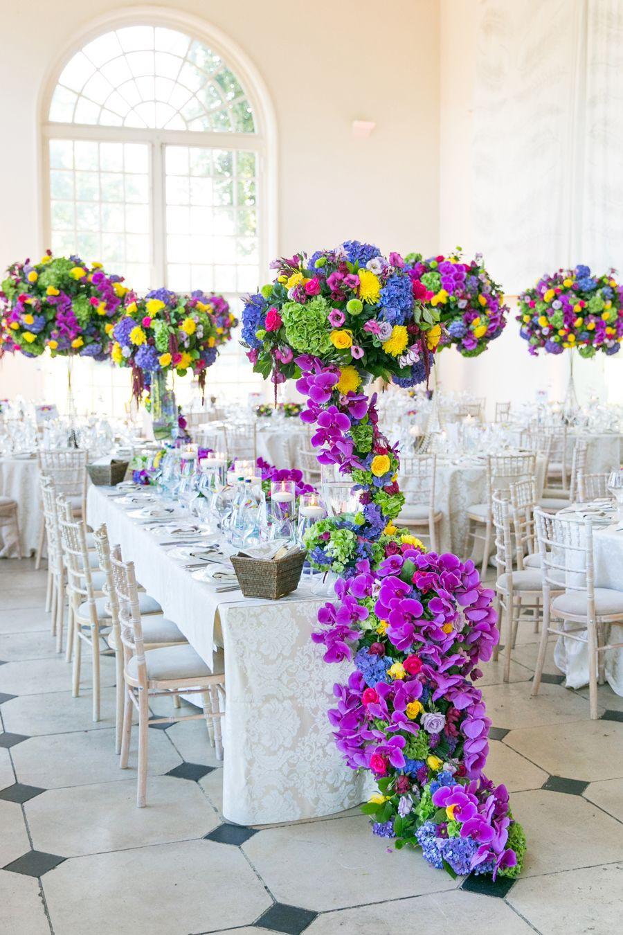
Image: Anneli Marinovich
We know this look isn't for everyone. But if you're going to inject your day with playful exuberance, combining colour-clash brights is the easy way to do it. Yellow, pink and purple are your base, but you can up the ante with blue and green, too - just so long as they're bold.
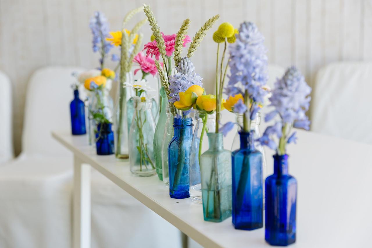
Image: Kirstin Prisk
It's possible to soften the look by dialling down the brightness a couple of shades, and having single-stem flower vases dotted around rather than large arrangements.
READ MORE: 33 Spring Wedding Colour Palette Ideas
8. Green, Pale Yellow & Apricot

Image: Matt Parry
You may associate a tropical colour scheme with juicy brights, like fuchsia and vibrant orange. However, this combination proves you can achieve the same paradise-island effect with gentler hues. The green, of course, has to be fresh and bold, reminiscent of the rainforest, but a buttery yellow and apricot have plenty of zing while still staying elegant.
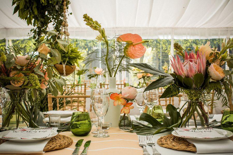
Image: Matt Parry
Keep the place settings simple to really let the colours sing - the raffia place mats here are perfect.
9. Mixed Jewels
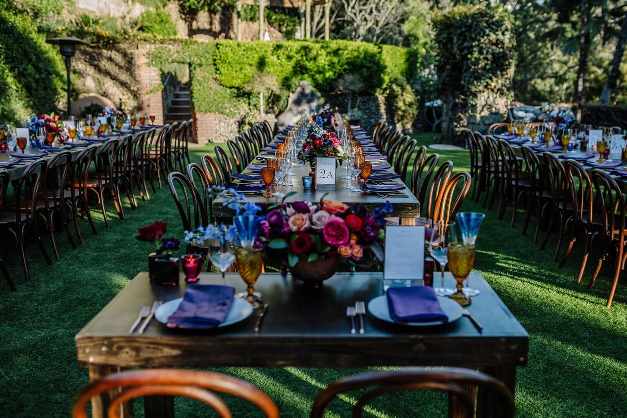
Image: Pinterest
This is a look that pulls together a lot of different colours. The base is a rich, dark purple, against which jewel tones really stand out: ruby red, sapphire blue and emerald green. Mix in some pastels for softness, and gold touches for a luxe finish.
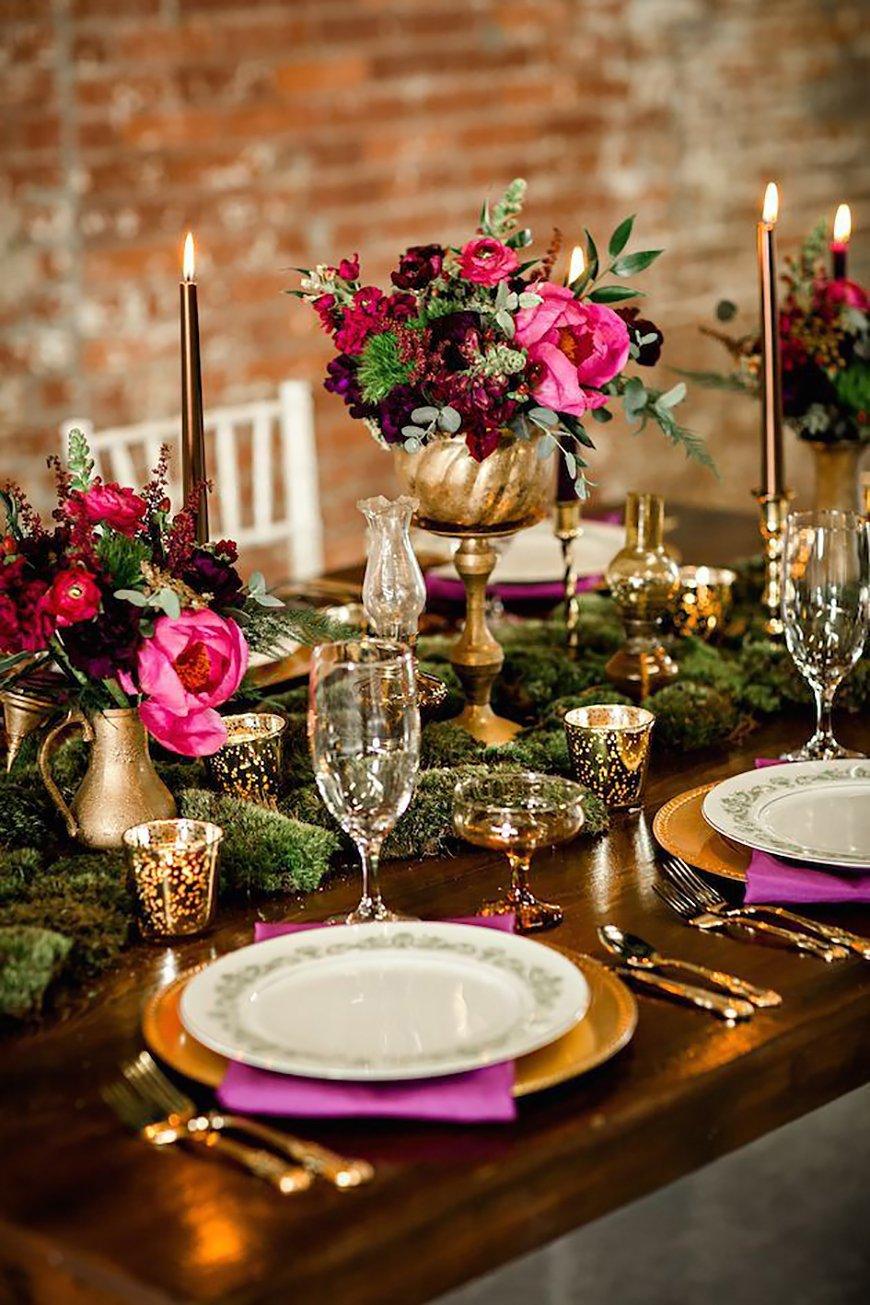
Image: Pinterest
READ MORE: 21 Winter Wedding Tips: How to Plan the Ultimate Winter Wedding
10. Pure White
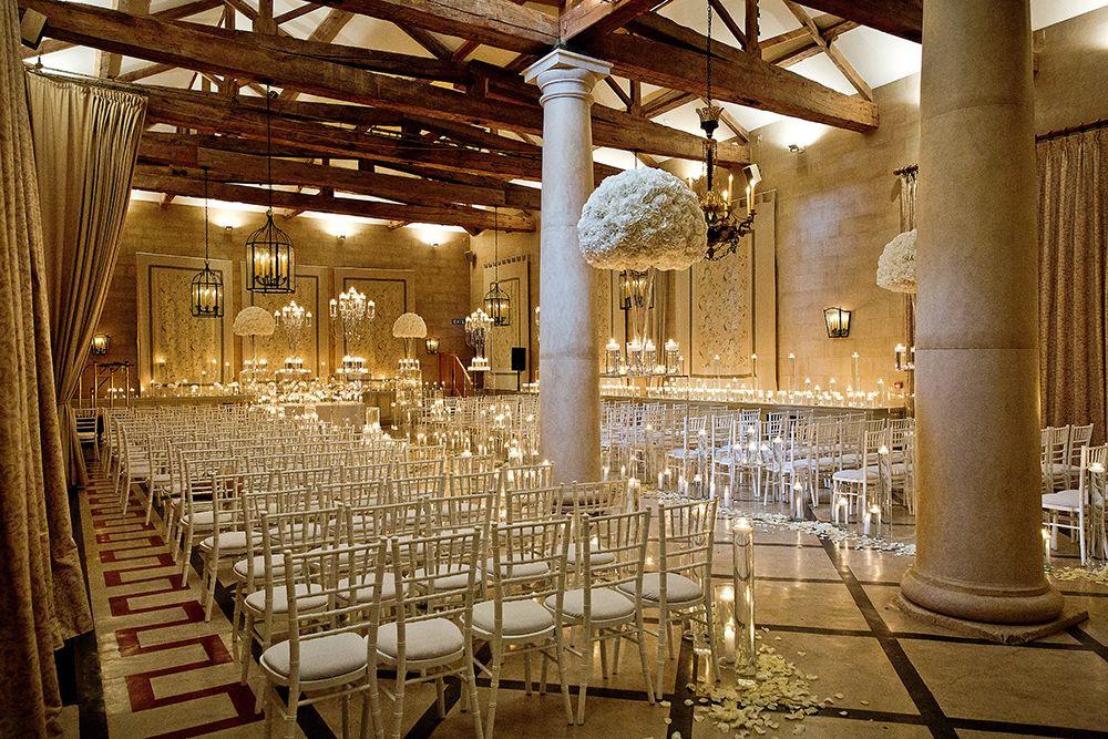
Image: Joe Short
A pure white look can be so refined. Just make sure it doesn't end up looking too stark - soft candlelight, for example, will create the right mood amid all your white flowers and décor.
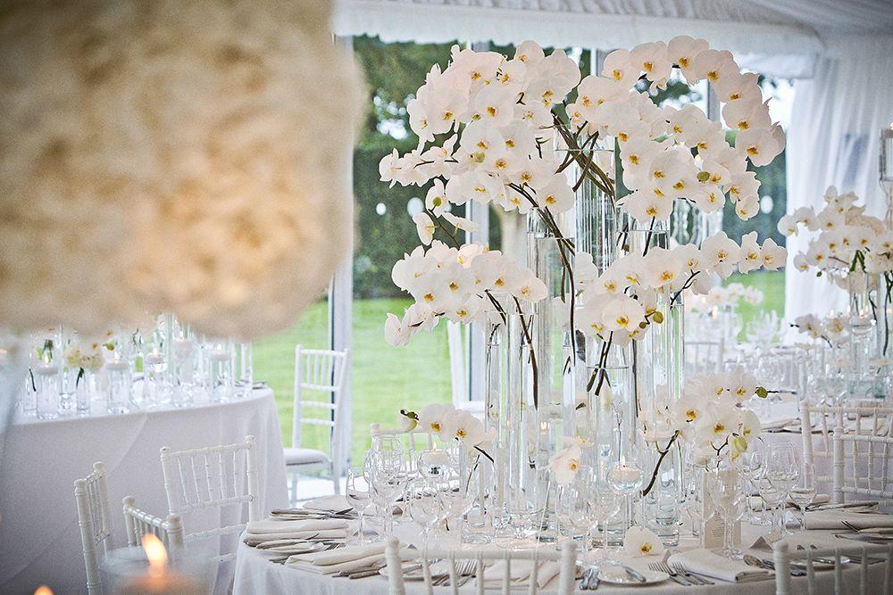
Image: Joe Short
Texture will also help when it comes to adding softness, so take that into account when choosing your blooms. Orchids are ideal - if you go for roses or tulips, make sure you don't have too much stem showing. The point is to achieve an all-white effect, not the white and green we showed you above.
11. Rust, Burnt Orange, Scarlet & Wine
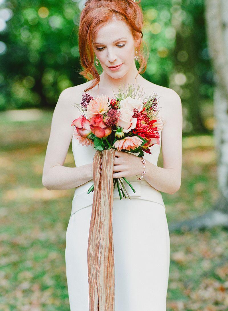
Image: Claire Graham
This is the perfect colour palette for an autumn wedding, as the combination reflects the naturally occurring hues of the season.
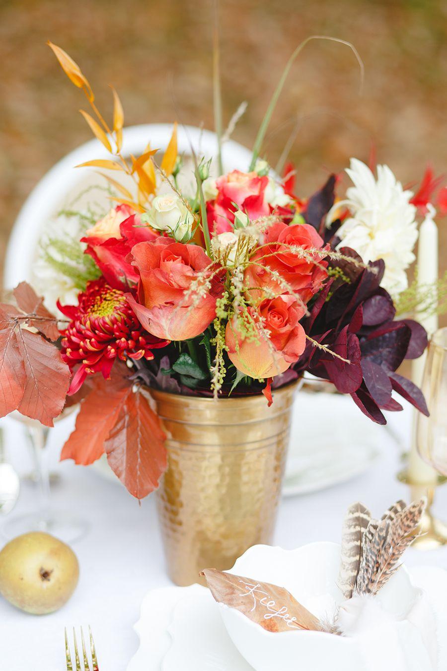
Image: Claire Graham
Using these colours in your bouquet results in a wonderfully vibrant effect.
12. Red & Sage/Silver-Green
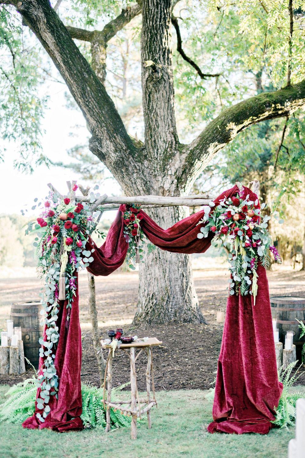
Image: Pinterest
Red and green is a classic winter wedding look. To keep it elegant rather giving than full-on Christmas vibes, we advise choosing a muted green - a pretty sage or a silvery, ashy green - and a dark red.
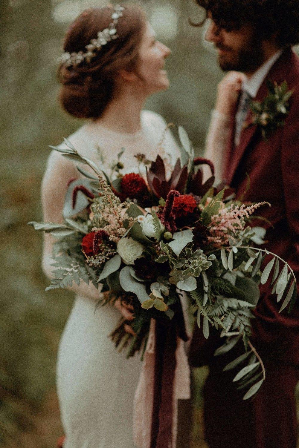
Image: Pinterest
In your floral arrangements, add some delicate, textured blooms, like astilbe, to soften the look. READ MORE: 17 reasons to have a winter wedding
13. Pastel Pink, Black & White
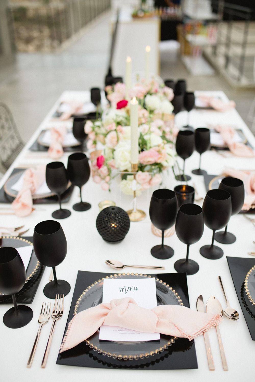
Image: Pinterest
We love a palette of strongly contrasting colours, like the prettiest of pinks against black and white. There's just a hint of retro '50s glamour about this combination, particularly if you add some metallic details.
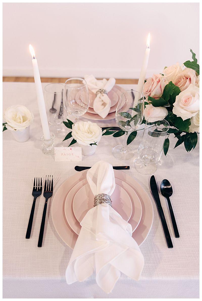
Image: Pinterest
The effect depends on the pink being a powdery, pretty shade - a bright pink gives a very different look.
READ MORE: 47 Fun and Unique Wedding Table Name Ideas
14. Navy, White & Gold
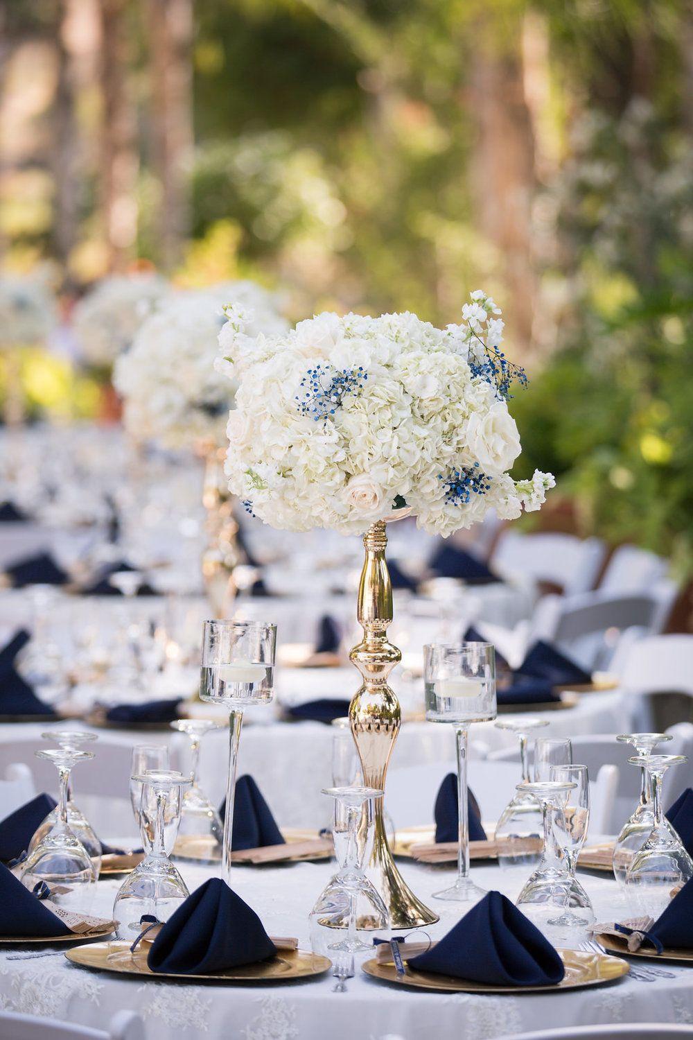
Image: Pinterest
Navy, white and gold combine to create a wonderfully refined wedding look. For extra romance, you can include some subtle pastel touches, in the palest of pinks and periwinkle.
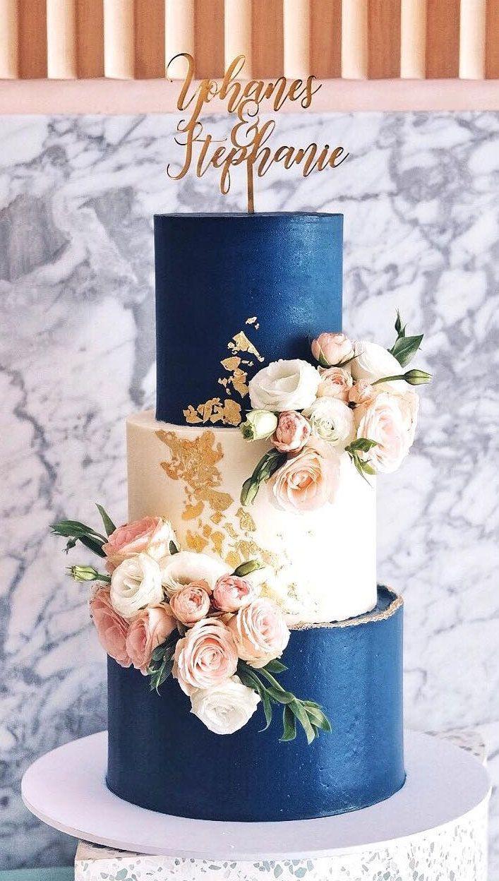
Image: Pinterest
This is a combination that works across so many wedding elements, from bridesmaid dresses to the cake.
15. Pink Ombre
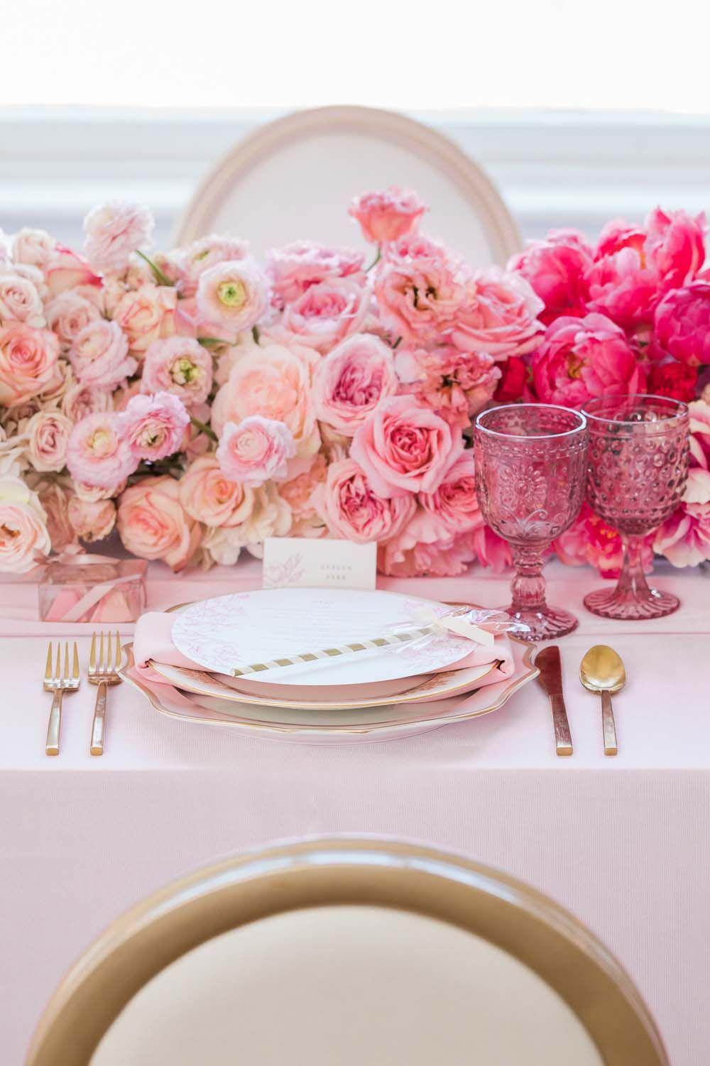
Image: Pinterest
Choosing just one colour and using multiple shades makes for a chic and cohesive wedding look. Pink lends itself particularly well to this because there's so much variety, from romantic blush to notice-me fuchsia.
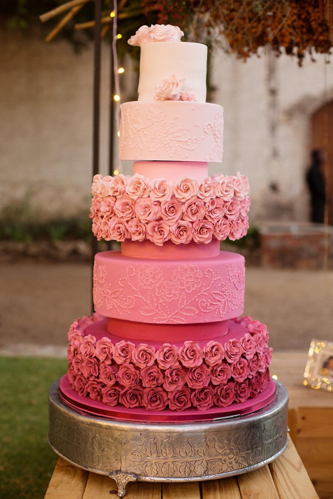
Image: Pinterest
One shade of pink alone risks being too sugary, but mixing up the shades gives you a carefree and contemporary look.
Once you've set your colour palette, it'll be easier to decide on your floral décor. So you know what to budget for this, we explain how much wedding flowers cost.

